🚀 Supercharge your YouTube channel's growth with AI.
Try YTGrowAI FreeHow to Plot a Graph for a DataFrame in Python?

Knowing how to plot a Dataframe will help you perform better data analysis in just a few lines of code. Visualizing a Dataframe is one of the first activities carried out by Data scientists to understand the data better.
Visualizing a dataset often gives a better picture and helps you plan out your course of action. It also makes it easy to spot outliers and make speculations for the existence of any correlation in the dataset.
In short, knowing how to visualize a Dataframe is an important skill to have.
Methods to Plot a Dataframe in Python
Let’s get started with importing a dataset.
1. Import the dataset
For the scope of this tutorial we are going to be using the California Housing dataset.
Let’s start with importing the data into a data frame using pandas.
import pandas as pd
housing = pd.read_csv("/sample_data/california_housing.csv")
housing.head()

Plotting using Pandas
You can plot your Dataframe using .plot() method in Pandas Dataframe.
You will need to import matplotlib into your python notebook. Use the following line to do so.
import matplotlib.pyplot as plt
1. Plotting Dataframe Histograms
To plot histograms corresponding to all the columns in housing data, use the following line of code:
housing.hist(bins=50, figsize=(15,15))
plt.show()
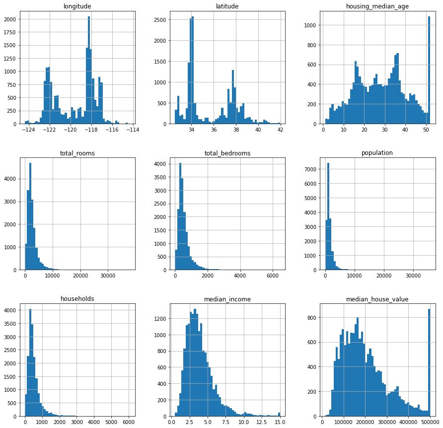
This is good when you need to see all the columns plotted together. Next, let’s look at how to make scatter plots between two columns.
2. Scatter Plots
Scatter plots help in determining correlation between two variables.
To plot a scatter plot between two variables use the following line of code :
housing.plot(x='population', y = 'median_house_value', kind='scatter')
plt.show()
This gives the following output :

We can see that there are a few outliers in the dataset. We can’t see a strong correlation between the two variables.
Let’s try plotting median income against median house value.
housing.plot(x='median_income', y = 'median_house_value', kind='scatter')
plt.show()

Here we can see a positive correlation between the two variables. As the median income goes up, the median housing value also tends to go up.
To see an example of an even stronger correlation let’s plot another scatter plot. This time between population and total rooms. Logically these two should have a strong positive correlation.
A positive correlation means that the two variables tend to increase and decrease together.
housing.plot(x='population', y = 'total_rooms', kind='scatter')
plt.show()

Our speculation was right, total rooms and population do have a strong positive correlation. We can say so because both the variables tend to increase together, as can be seen in the graph.
The different arguments that you can use while plotting different plots are as follows:
- ‘line’ : line plot (default)
- ‘bar’ : vertical bar plot
- ‘barh’ : horizontal bar plot
- ‘hist’ : histogram
- ‘box’ : boxplot
- ‘kde’ : Kernel Density Estimation plot
- ‘density’ : same as ‘kde’
- ‘area’ : area plot
- ‘pie’ : pie plot
- ‘scatter’ : scatter plot
- ‘hexbin’ : hexbin plot
Plotting using Seaborn
Alternatively, you can also plot a Dataframe using Seaborn. It is a Python data visualization library based on matplotlib. It provides a high-level interface for drawing attractive and informative statistical graphics.
Seaborn is a very powerful visualization tool. You get a lot of customization options along with it.
1. Import Seaborn
Let’s start with importing Seaborn into our python notebook.
import seaborn as sns
2. Using Distplot
Seaborn provides the option to plot a distplot . A distplot is a histogram with an automatic calculation of a good default bin size.
You can create one using the following line of code :
sns.distplot(housing['median_house_value'])

Here also you can spot the outlier. Let’s try plotting one for median income as well.
sns.distplot(housing['median_income'])

Conclusion
This tutorial was about plotting a Pandas Dataframe in Python. We covered two different methods of plotting a DataFrame. Hope you had fun learning with us!