🚀 Supercharge your YouTube channel's growth with AI.
Try YTGrowAI FreePython Matplotlib Tutorial

Python Matplotlib is a library which basically serves the purpose of Data Visualization. The building blocks of Matplotlib library is 2-D NumPy Arrays.
Thus, comparatively huge amount of information/data can be handled and represented through graphs, charts, etc with Python Matplotlib.
Getting Started with Python Matplotlib
In order to use the Matplotlib library for data visualization, we need to install it through pip command.
pip install matplotlib
Taking it ahead, we need to import this library whenever we wish to use its built-in functions.
from matplotlib import pyplot
matplotlib.pyplot is basically an interface which is used to add style functions to the graphs, charts, etc created using Matplotlib package.
Plotting with Python Matplotlib
Python Matplotlib offers various types of charts to represent and visualize the data.
The following types of graphs/charts can be used to visualize the data using Python Matplotlib:
- Line Plot
- Scatter Plot
- Histogram
- Bar Chart
- Pie Chart
1. Line Plot
from matplotlib import pyplot

# x-axis values
roll_num = [1, 2, 3, 4, 5, 6, 7, 8, 9]

# y-axis values
marks = [55,75,96,75,36,45,87,99,100]


pyplot.plot(roll_num, marks)


pyplot.show()
In the above snippet of code, we have used two Python lists (roll_num, marks) as the input data points.
pyplot.plot() function is used to plot the line representing the data. It accepts x-axis and y-axis values as parameters.
pyplot.show() function is used to display the plotted values by pyplot.plot() function.
Output:

2. Scatter Plot
from matplotlib import pyplot

# x-axis values
roll_num = [1, 2, 3, 4, 5, 6, 7, 8, 9]

# y-axis values
marks = [55,75,96,75,36,45,87,99,100]


pyplot.scatter(roll_num, marks)


pyplot.show()
pyplot.scatter(x-axis, y-axis) is used to plot the data in a scattered fashion.
Output:

3. Histogram
from matplotlib import pyplot


marks = [55,75,96,75,36,45,87,99,100]


pyplot.hist(marks, bins = 7)


pyplot.show()
pyplot.hist() function is used to represent the data points through a Histogram. It accepts two parameters:
- List of the data to be plotted
- Number of ranges(bins) to divide and display the data.
In the above snippet of code, pyplot.hist() accepts a parameter bin which basically represents the number of divisions to distribute and display the input list values (data).
Output:

4. Bar Charts
import numpy as np
import matplotlib.pyplot

city = ('Pune', 'Satara', 'Mumbai', 'Kanpur', 'Bhopal', 'Assam')
y_val = np.arange(len(city))
rank = [4, 7, 1, 3, 2, 5]

pyplot.bar(y_val, rank, align='center')
pyplot.xticks(y_val, city)
pyplot.ylabel('Rank')
pyplot.title('City')

pyplot.show()
pyplot.bar() function represents the data in the form of rectangular bars. This function accepts a parameter y-val which are the scalar values to represent the x co-ordinates. The parameter align is used to set the bar plot values to either left/ right/ center.
pyplot.xticks() is used to set the tick locations for x-axis.
pyplot.ylabel() is used to set a label-text value to the data of y-axis.
pyplot.title()sets a title value to the Bar Chart.
Output:

5. Pie Charts
import numpy as np
import matplotlib.pyplot

city = ('Pune', 'Satara', 'Mumbai', 'Kanpur', 'Bhopal', 'Assam')

rank = [4, 7, 1, 3, 2, 5]
explode = (0.2, 0, 0, 0, 0, 0)
colors = ['yellowgreen', 'pink', 'purple', 'grey', 'red', 'orange']


pyplot.pie(rank, explode=explode, labels=city, colors=colors,
        autopct='%1.1f%%', shadow=True, startangle=120)

pyplot.axis('equal')

pyplot.show()
pyplot.pie() function is used to represent the data in the form of a pie chart.
These parameters of pyplot.pie() serve the following functions:
explode: provides a scalar value to set a fraction of the pie chart apart.labels: provides text values to represent each fraction of the chart.colors: provides the colors to set to each fraction of the chart.autopct: labels the wedges or the fractions of the chart with a numeric value.shadow: Accepts boolean values. If set to TRUE, it creates shadow beneath the fractions of the pie chart.startangle: rotates the start of the chart by a particular degree from x-axis.
pyplot.axis('equal') function enables equal scaling and creates scaled circle charts.
Output:

Adding features to Charts in Matplotlib
from matplotlib import pyplot

# x-axis values
roll_num = [1, 2, 3, 4, 5, 6, 7, 8, 9]

# y-axis values
marks = [55,75,96,75,36,45,87,99,100]
attendance = [25, 75, 86, 74, 85, 25, 35, 63, 29]
pyplot.plot(roll_num, marks, color = 'green', label = 'Marks')
pyplot.plot(roll_num, attendance, color = 'blue', label = 'Attendance')
pyplot.legend(loc='upper left', frameon=True)

pyplot.show()
In the above snippet of code, we have added attributes such as color and label.
The label attribute sets text to represent the plotted values in a much simplified manner.
pyplot.legend() places the label and information on the plotted chart.
The parameter loc is used to set the position of the labels to be displayed.
The parameter frameon accepts boolean values. If set to true, it creates a rectangular box like border around the labels placed by the position set through loc parameter.
Output:

Plotting using Object-oriented API in Matplotlib
Data Visulaization in Python can also be done using the Object Oriented API.
Syntax:
Class_Name, Object_Name = matplotlib.pyplot.subplots(‘rows’, ‘columns’)
Example:
# importing the matplotlib library
import matplotlib.pyplot as plt

# x-axis values
roll_num = [1, 2, 3, 4, 5, 6, 7, 8, 9]

# y-axis values
marks = [55,75,96,75,36,45,87,99,100]

# creating the graph with class 'img'
# and it's object 'obj' with '1' row
# and '1' column
img, obj = plt.subplots(1, 1)

# plotting the values
obj.plot(roll_num, marks)


# assigning the layout to the values
img.tight_layout()
img represents the name of the class and obj refers to the name of the object.
pyplot.subplots(no of rows, no of columns) function enables the creation of common and multiple layouts/figures in a single function call.
It accepts number of rows and number of columns as mandatory parameters to create the sub-sections for plotting the values. The default value is pyplot.subplots(1,1) which creates only one layout of the input data.
class_name.tight.layout() adjusts the parameters of pyplot.subplots() to fit into the figure area of the chart.
Output:

Manipulating PNG Images with Matplotlib
Python Matplotlib provides functions to work with PNG Image files too.
Let’s understand it with the help of an example.
Example:
# importing pyplot and image from matplotlib
import matplotlib.pyplot as plt
import matplotlib.image as img

# reading png image file
img = img.imread('C:\\Users\\HP\\Desktop\\Pie Chart.png')
color_img = img[:, :, 0]  #applying default colormap
# show image
plt.imshow(color_img)
In the above snippet of code, matplotlib.image.imread(image path) is used to read an input image.
color_img = img[: , : , 0] is used to set the default colormap to the image to highlight it.
pyplot.imshow() is used to display the image.
Original Image:

Output Image:

Plotting with Pandas and Matplotlib
Python Matplotlib can be used to represent the data through vivid plotting techniques using the Pandas Module as well.
To serve the purpose, we will need to install and import Python Pandas Module. We can further create DataFrames to plot the data.
The following are the different types of graphs/charts to be used to plot data in Matplotlib with Pandas Module:
- Histogram
- Box Plot
- Density Plot
- Hexagonal Bin Plot
- Scatter Plot
- Area Plot
- Pie Plot
1. Histogram
import matplotlib.pyplot as p
import pandas as pd
import numpy as np

val = pd.DataFrame({'v1': np.random.randn(500) + 1,
'v2': np.random.randn(500),
'v3': np.random.randn(500) - 1},
columns =['v1', 'v2', 'v3'])

p.figure()

val.plot.hist(alpha = 0.5)
p.show()
plot.hist() function is used to plot the data values. The parameter alpha is basically a float value used to blend the color scale of the plotted graph.
pyplot.figure() function is to create a figure out of the input values.
In the above snippet of code, we have generated random data for the input values using numpy.random.randn() function of Python NumPy Module.
Output:

2. Box Plot
from matplotlib import pyplot
import pandas as pd
import numpy as np

val = pd.DataFrame(np.random.randn(500,6),
columns =['P', 'Q', 'R', 'S', 'T', 'W'])

val.plot.box()
pyplot.show()
plot.box() function is used to represent the group of scalar data through quartiles.
Further, we have plotted six quartiles by passing six-column values to it.
Output:

3. Density Plot
It is basically a Kernael DensityEstimation (KDE) plot. It provides the probability density function of the input values.
from matplotlib import pyplot
import pandas as pd
import numpy as np

val = pd.DataFrame(np.random.randn(500,2),
columns =['P', 'Q',])

val.plot.kde()
pyplot.show()
plot.kde() function is used to plot the probability density of the randomly generated values.
Output:

4. Hexagonal Bin Plot
Hexagonal Bin Plot is used to estimate the relationship between two scalar values among a large set of data values.
from matplotlib import pyplot
import matplotlib.pyplot
import pandas as pd
import numpy as np

val = pd.DataFrame(np.random.randn(500,2),
columns =['Temperature', 'Fire-Intensity',])
val.plot.hexbin(x ='Temperature', y ='Fire-Intensity', gridsize = 30)

pyplot.show()
plot.hexbin()function plots the numeric relationship between the passed values i.e. Temperature and Fire-Intensity.
The parameter gridsize is used to set the number of hexagons in the x – direction representing the relationship between the passed values.
Output:

5. Scatter Plot
import matplotlib.pyplot
import pandas as pd
import numpy as np

val = pd.DataFrame(np.random.randn(300,5),
columns =['A', 'Z', 'W', 'Y', 'S'])
val.plot.scatter(x='Z', y='Y')
pyplot.show()
Output:

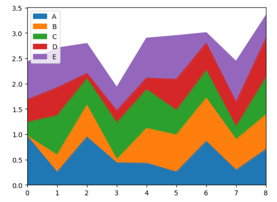
6. Area Plot
import matplotlib.pyplot as plt
import pandas as pd
import numpy as np

val = pd.DataFrame(np.random.rand(9, 5), columns =['A', 'B', 'C', 'D', 'E'])

val.plot.area()
plt.show()
plot.area() is used to plot the input data accordingly. By this function, all the columns passed as input to the DataFrame are plotted as a section of the area in the chart.
Output:
7. Pie Plot
import matplotlib.pyplot as plt
import pandas as pd
import numpy as np

val = pd.Series(np.random.rand(5),
index =['w','f', 'e', 'b', 'a'], name ='Pie-Chart')

val.plot.pie(figsize =(5, 5))
plt.show()
plot.pie() function is used to represent the input data in the form of a pie chart.
The parameter figsize is used to set the width and height of the plotted figure.
Output:

Conclusion
Thus, in this article, we have understood the functions offered by Python’s Matplotlib library.
References
- Python Matplotlib Tutorial
- Python Matplotlib Documentation