🚀 Supercharge your YouTube channel's growth with AI.
Try YTGrowAI FreeClassifying Clothing Images in Python – A complete guide

Hello, folks! In this tutorial, we’ll have a look at how the Classification of various clothing images takes place with the help of TensorFlow using the Python programming language.
The social media platforms Instagram, YouTube, and Twitter have taken over our daily lives. Models and celebrities, in particular, need to know how to categorize clothing into several categories if they want to look their best.
Also read: Crypto Price Prediction with Python
The classification of fashion items in a photograph includes the identification of individual garments. The same has applications in social networking, e-commerce, and criminal law as well.
Step 1: Importing modules
The first step in every project is to import all the required modules. We’ll be working with Tensorflow along with numpy and matplotlib.
import tensorflow as tf
import numpy as np
import matplotlib.pyplot as plt
Step 2: Loading and pre-processing of data
The dataset that we are going to load into our program can be seen here.
This dataset includes 60,000 photos in grayscale, each measuring 28x28 pixels, from ten different fashion categories, plus a dummy set of 10,000 images.
MNIST can be replaced using this dataset. The code line below achieves the loading of data.
fashion_data=tf.keras.datasets.fashion_mnist
Step 3: Training and Testing Data Split
A major part of any Machine Learning model includes dividing the data into two parts based on the 80-20 rule.
The 80-20 rule states that 80% of the data is sent to training data and 20% to testing data. The code below splits the data into training and testing.
(inp_train,out_train),(inp_test,out_test)=fashion_data.load_data()
inp_train = inp_train/255.0
inp_test = inp_test/255.0
print("Shape of Input Training Data: ", inp_train.shape)
print("Shape of Output Training Data: ", out_train.shape)
print("Shape of Input Testing Data: ", inp_test.shape)
print("Shape of Output Testing Data: ", out_test.shape)
The code also normalizes the dataset loaded.
Shape of Input Training Data:  (60000, 28, 28)
Shape of Output Training Data:  (60000,)
Shape of Input Testing Data:  (10000, 28, 28)
Shape of Output Testing Data:  (10000,)
Step 4: Data Visualization
The code to visualize the initial data is as follows:
plt.figure(figsize=(10,10))
for i in range(100):
    plt.subplot(10,10,i+1)
    plt.imshow(inp_train[i])
    plt.xticks([])
    plt.yticks([])
    plt.xlabel(out_train[i])
    plt.tight_layout()
plt.show()

Step 5: Changing the labels to actual names
We have seen the visualization, but we also want the labels to have well-defined names. The code mentioned below will achieve the purpose.
Labels=['T-shirt/top', 'Trouser', 'Pullover', 'Dress', 'Coat','Sandal', 'Shirt', 'Sneaker', 'Bag', 'Ankle boot']
plt.figure(figsize=(10,10))
for i in range(100):
    plt.subplot(10,10,i+1)
    plt.xticks([])
    plt.yticks([])
    plt.imshow(inp_train[i], cmap=plt.cm.binary)
    plt.xlabel(Labels[out_train[i]])
    plt.tight_layout()
plt.show()

You can see now that the visualization is now more understandable.
Step 6: Building, Compiling, and Training the model
The code for the building, compiling, and training of the TensorFlow and Keras model is displayed below:
my_model = tf.keras.Sequential([
    tf.keras.layers.Flatten(input_shape=(28, 28)),
    tf.keras.layers.Dense(128, activation='relu'),
    tf.keras.layers.Dense(10)
])
my_model.compile(optimizer='adam',
              loss=tf.keras.losses.SparseCategoricalCrossentropy(from_logits=True),
              metrics=['accuracy'])
my_model.fit(inp_train, out_train, epochs=20)
Step 7: Checking the final loss and accuracy
Now that our model is trained successfully, it now turns to compute the loss and find the final accuracy of the model created and trained.
loss, accuracy = my_model.evaluate(inp_test,out_test,verbose=2)
print('\nAccuracy:',accuracy*100)
The final accuracy we get after the whole processing of our model is 88.8% which is pretty good.
Step8: Make Predictions
We have come to the final step of the program that is making predictions using the model we just created and trained.
prob=tf.keras.Sequential([my_model,tf.keras.layers.Softmax()])
pred=prob.predict(inp_test)
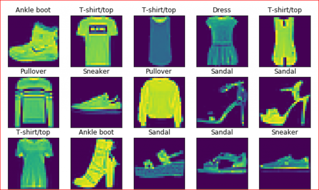
Step 9: Visualizing the final predictions
It is important for any classification model, that we make the final visualization. To make this simpler we will be visualizing the first 20 images of the dataset.
plt.figure(figsize=(20,20))
for i in range(20):
    true_label,image = out_test[i],inp_test[i]
    pred_label = np.argmax(pred[i])
    plt.subplot(10,10,i+1)
    plt.xticks([])
    plt.yticks([])
    plt.imshow(image, cmap=plt.cm.binary)
    if pred_label == true_label:
        color = 'green'
        label="Correct Prediction!"
    else:
        color = 'red'
        label="Wrong Prediction!"
    plt.tight_layout()
    plt.title(label,color=color)
    plt.xlabel(" {} -> {} ".format(Labels[true_label],Labels[pred_label]))

Thank you for reading the tutorial. I hope you learned a lot through it.
Happy Learning! Keep reading to learn more.
- Calculating Precision in Python — Classification Error Metric
- Iris Dataset Classification with Multiple ML Algorithms
- Theoretical Introduction to Recommendation Systems in Python


