🚀 Supercharge your YouTube channel's growth with AI.
Try YTGrowAI FreeHow to Plot and Customize a Pie Chart in Python?

A pie chart is a circular statistical graphic, which is divided into slices to illustrate numerical proportions. In a pie chart, the arc length of each slice is proportional to the quantity it represents.
Pie charts are a popular way to represent the results of polls. In this tutorial, we will learn how to plot a pie-chart. Furthermore, we will learn how to customize a pie chart in python.
Let’s get started.
Create sample data
Let’s create some sample data that we can use while plotting the pie-chart.
labels = 'Cricket', 'Football', 'Hockey', 'F1'
sizes = [15, 30, 45, 10]
The data is representative of an opinion poll on people’s preferred sport.
How to plot a Pie Chart?
To plot a Pie-Chart we are going to use matplotlib.
import matplotlib.pyplot as plt
To plot a basic Pie-chart we need the labels and the values associated with those labels.
labels = 'Cricket', 'Football', 'Hockey', 'F1'
sizes = [15, 30, 45, 10]

fig1, ax1 = plt.subplots()
ax1.pie(sizes, labels=labels)
ax1.axis('equal')
plt.show()
On running the above code snippet we get the following output :
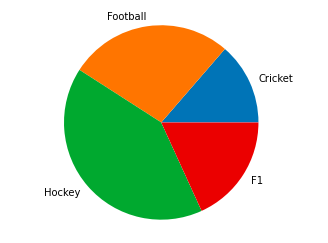
Note that this is a very basic pie-chart.
Now let’s see how can we customize the pie-chart and make it look more interesting.
Customizing a Pie Chart in Python
Matplotlib offers a lot of customization options when plotting a pie-chart. Let’s look at these, one by one.
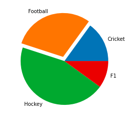
1. Make a slice pop-out
You can make one or more slices of the pie-chart pop-out using the explode option.
For this let’s declare an array that has the explosion values. The explosion array specifies the fraction of the radius with which to offset each slice.
import matplotlib.pyplot as plt

labels = 'Cricket', 'Football', 'Hockey', 'F1'
sizes = [15, 30, 45, 10]

explode = (0, 0.1, 0, 0)
fig1, ax1 = plt.subplots()
ax1.pie(sizes, explode=explode, labels=labels)
plt.show()
Output :
Let’s try some different explosion values.
import matplotlib.pyplot as plt

labels = 'Cricket', 'Football', 'Hockey', 'F1'
sizes = [15, 30, 45, 10]

explode = (0.4, 0.2, 0.2, 0.2)
fig1, ax1 = plt.subplots()
ax1.pie(sizes, explode=explode, labels=labels)
plt.show()

2. Rotate the Pie-chart
You can rotate the pie-chart by setting a strartangle.
It rotates the start of the pie chart by specified value in degrees counterclockwise from the x-axis.
Let’s see it in action :
import matplotlib.pyplot as plt

labels = 'Cricket', 'Football', 'Hockey', 'F1'
sizes = [15, 30, 45, 10]

fig1, ax1 = plt.subplots()
explode = (0, 0.1, 0, 0)
ax1.pie(sizes, explode=explode, labels=labels,
        shadow=True, startangle=90)

plt.show()
Output :

import matplotlib.pyplot as plt

labels = 'Cricket', 'Football', 'Hockey', 'F1'
sizes = [15, 30, 45, 10]

fig1, ax1 = plt.subplots()
explode = (0, 0.1, 0, 0)
ax1.pie(sizes, explode=explode, labels=labels,
        shadow=True, startangle=45)

plt.show()

3. Display Percentages
You can also display the percentage along with each slice by using the following lines of code :
import matplotlib.pyplot as plt

labels = 'Cricket', 'Football', 'Hockey', 'F1'
sizes = [15, 30, 45, 10]

fig1, ax1 = plt.subplots()
explode = (0, 0.1, 0, 0)
ax1.pie(sizes, explode=explode, labels=labels,autopct='%1.1f%%',
        shadow=True, startangle=90)

plt.show()
Output :

4. Customizing colours
Matplotlib gives you the option to get creative and make your pie-chart look as vibrant as possible.
To change the colours of your pie chart, use the following lines of code.
import matplotlib.pyplot as plt

labels = 'Cricket', 'Football', 'Hockey', 'F1'
sizes = [15, 30, 45, 10]

colors = ( "orange", "cyan", "brown",
          "grey")
fig1, ax1 = plt.subplots()
explode = (0, 0.1, 0, 0)
ax1.pie(sizes, colors = colors, explode=explode, labels=labels,autopct='%1.1f%%',
        shadow=True, startangle=90)

plt.show()
Here we declare 4 colors that we want to use in a list. Then we pass that list as an argument while plotting the pie-chart.
The output comes out as :

5. Displaying colour codes
Along with your pie-chart, you can also display a box that contains the colour scheme of your pie-chart. This is especially useful when there are a lot of slices in your pie-chart.
To display the colour codes use the following snippet :
import matplotlib.pyplot as plt

labels = 'Cricket', 'Football', 'Hockey', 'F1'
sizes = [15, 30, 45, 10]

colors = ( "orange", "cyan", "brown",
          "grey")
fig1, ax1 = plt.subplots()
explode = (0, 0.1, 0, 0)

ax1.pie(sizes, colors = colors, explode=explode, labels=labels,autopct='%1.1f%%', shadow=True, startangle=90)
patches, texts, auto = ax1.pie(sizes, colors=colors, shadow=True, startangle=90,explode=explode, autopct='%1.1f%%' )

plt.legend(patches, labels, loc="best")
plt.show()
Output :

Conclusion
This tutorial was about how to plot and customize a pie-chart in Python using Matplotlib. Hope you had fun learning with us. To go through the official documentation of matplotlib, use this link.