🚀 Supercharge your YouTube channel's growth with AI.
Try YTGrowAI FreeVenn Diagrams in Python

The Venn diagram is one of the most obvious data visualizations for illustrating the overlap between two or three data categories or “sets.” John Venn designed these diagrams in the late 1800s; they depict each set of data in a circle, with the overlap signifying the degree of resemblance between the groups.
You might have drawn them on paper very easily. But did you know you can visualize them using python programming language? Guess what! It’s possible with just a few lines of code.
Let’s get the fun started!
Code Implementation for Venn Diagrams
It’s possible to create Venn diagrams using the Matplotlib library. The easiest way is to use the matplotlib_venn package which makes it very simple to create Venn diagrams with far less code.
We would require the pandas and matplotlib libraries installed and along with this, we need to install the matplotlib_venn library using the pip install matplotlib_venn in the command prompt.
import pandas as pd
from matplotlib import pyplot as plt
from matplotlib_venn import venn2
from matplotlib_venn import venn3
Pandas will be used to generate some synthetic data to be plotted using Venn diagrams. Typically, while building a Venn diagram, the number of objects in each group and the overlap must be specified.
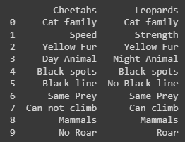
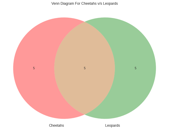
For the purpose of this tutorial, we will use a categorical dataset with two categories including characteristics of two separate animals: cheetahs and leopards.
We shall outline the unique and shared characteristics of the two animals. The following code fragment will produce the dataset for us.
data = {'Cheetahs': ['Cat family','Speed','Yellow Fur','Day Animal',
                     'Black spots','Black line','Same Prey','Can not climb','Mammals','No Roar'],
        'Leopards': ['Cat family','Strength','Yellow Fur','Night Animal',
                     'Black spots','No Black line','Same Prey','Can climb','Mammals','Roar']
       }
df = pd.DataFrame(data, columns = ['Cheetahs', 'Leopards'])
print(df)
To create a simple Venn diagram containing the Cheetahs and Leopards sets, we can call the venn2() function and pass in two values: a list of the characteristics of the two animals and a tuple of the set_labels, i.e. the names of the two animals.
plt.style.use('seaborn')

plt.figure(figsize=(10,10))
plt.title("Venn Diagram For Cheetahs v/s Leopards")

venn2([set(df['Cheetahs'].to_list()),
       set(df['Leopards'].to_list())],
       set_labels=('Cheetahs', 'Leopards')
     )

plt.show()
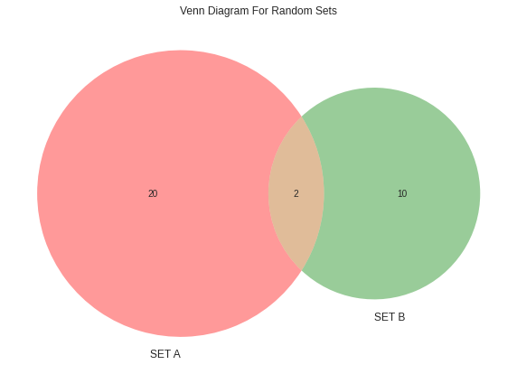
Instead of defining the dataset, if you wish to blankly define sets and pass the values of the difference and union of the sets using the code below.
plt.style.use('seaborn')

plt.figure(figsize=(10,10))
plt.title("Venn Diagram For Random Sets")

# (Set1,Set2,Union)
venn2(subsets = (20, 10, 2),
      set_labels = ('SET A', 'SET B'))

plt.show()
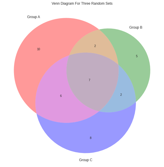
Lastly, let’s try to create a Venn diagram for three sets instead of limiting it to two sets. The difference here will be that we will be using the venn3() function instead of the venn2() function as we were doing before. Look at the code below, where we take 3 random sets, and distribution is done randomly as well.
plt.style.use('seaborn')

plt.figure(figsize=(10,10))
plt.title("Venn Diagram For Three Random Sets")

# (Set1,Set2,1n2,Set3,1n3,2n3,1n2n3)
venn3(subsets=(10, 5, 2, 8, 6, 2, 7),
      set_labels=('Group A', 'Group B', 'Group C'))

plt.show()