🚀 Supercharge your YouTube channel's growth with AI.
Try YTGrowAI FreeAnimating Data in Python – A Simple Guide

I ran into this problem when my sensor data kept piling up faster than I could make sense of it. A table of numbers told me something was wrong, but watching the values spike in real time told me exactly when and how much. That gap between static charts and live data is where animating visualizations becomes genuinely useful rather than just decorative.
This article covers animating data in Python using matplotlib. By the end, you will know how plt.pause() handles simple cases, how FuncAnimation and ArtistAnimation work for more control, how to save animations to files, and where live plots show up in production systems.
TLDR
- plt.pause(interval) redraws the current figure and blocks for the given interval inside a loop
- FuncAnimation calls an update function each frame to modify plot data in place
- ArtistAnimation pre-builds a list of artists and displays them sequentially
- ani.save() with writer=”pillow” exports a GIF without extra dependencies
- Live plots appear in finance dashboards, medical monitors, and IoT sensor feeds
What is animating data in Python?
Animating data in Python means updating a visualization frame-by-frame so the viewer watches changes unfold over time rather than comparing before-and-after snapshots. matplotlib provides three main tools for this: plt.pause() inside a loop, FuncAnimation for function-driven frame updates, and ArtistAnimation for pre-rendered sequences. All three rebuild or swap plot elements on a schedule without requiring any video recording infrastructure.
Simple animation with plt.pause()
The fastest path to a live plot is drawing your data, calling plt.pause(interval), and repeating. Each pause refreshes the display and blocks execution for roughly interval seconds. No special classes, no initialization functions, no imports beyond standard matplotlib. This works directly inside a regular for loop, which makes it the most straightforward approach for quick prototyping.
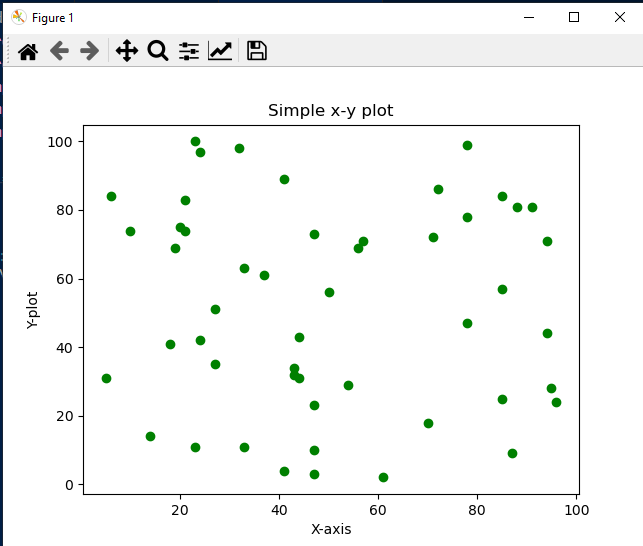
The example below grows a scatter plot from 1 to 50 points. New points appear one at a time with a 0.01-second gap between each frame, producing the illusion of continuous motion without any animation-specific setup.
import matplotlib.pyplot as plt
import random

x = []
y = []

plt.xlabel("X-axis")
plt.ylabel("Y-axis")
plt.title("Growing Scatter Plot")

for i in range(50):
    x.append(random.randint(0, 100))
    y.append(random.randint(0, 100))
    plt.scatter(x, y, color="green")
    plt.pause(0.01)

plt.show()
Frame 0:  1 point plotted
Frame 1:  2 points plotted
Frame 4:  5 points plotted
Frame 49: 50 points plotted
The window stays open and updates live as points are added.
The same pattern works for bar charts, line graphs, or any other matplotlib plot type. Replace plt.scatter() with plt.bar() and the bars grow upward frame by frame. The limitation of plt.pause() is that it redraws the entire figure from scratch on each call. For animations that need precise initialization, blitting for performance, or frame-level data management, matplotlib.animation has two dedicated classes.
FuncAnimation in matplotlib
FuncAnimation stands for function animation. Instead of a loop calling plt.pause(), you pass an update function that matplotlib calls once per frame. The function receives the current frame number or value from a frames iterator and modifies the plot data directly. This gives fine-grained control over exactly what changes each frame, which axes get redrawn, and how blitting optimizes performance.
Syntax of FuncAnimation
class matplotlib.animation.FuncAnimation(
    fig, func,
    frames=None,
    init_func=None,
    fargs=None,
    save_count=None,
    *, cache_frame_data=True,
    **kwargs
)
Parameters:
  fig         - Figure object to animate
  func        - Update function called each frame
  frames      - Iterable producing frame values (int, float, or custom)
  init_func   - Optional setup function called before first frame
  blit        - If True, only redraw changed artists (faster)
  fargs       - Additional arguments passed to func
Animating a sine wave with FuncAnimation
The example below builds a sine wave one frame at a time. The init function sets axis limits once and returns the artists that get cleared before the first frame. The update function receives frame values from np.linspace (0 to 2*pi in 128 steps), appends each new point to the data lists, and calls set_data() on the line artist. With blit=True, matplotlib only redraws the pixels that changed, which keeps animations responsive even with large datasets.
import numpy as np
import matplotlib.pyplot as plt
from matplotlib.animation import FuncAnimation

fig, ax = plt.subplots()
xdata, ydata = [], []
line, = plt.plot([], [], 'ro', ms=6)

def init():
    ax.set_xlim(0, 2 * np.pi)
    ax.set_ylim(-1.1, 1.1)
    return line,

def update(frame):
    xdata.append(frame)
    ydata.append(np.sin(frame))
    line.set_data(xdata, ydata)
    return line,

ani = FuncAnimation(
    fig, update,
    frames=np.linspace(0, 2 * np.pi, 128),
    init_func=init,
    blit=True
)
plt.show()
Frame 0:   x=0.000,  y=0.000
Frame 32:  x=1.571,  y=1.000
Frame 64:  x=3.142,  y=0.000
Frame 128: x=6.283,  y=0.000 (full cycle complete)
The comma after plt.plot is intentional. It unpacks the returned Line2D object as a scalar rather than a list, which is what set_data() expects when called from the update function. The init function must return the visible artists, otherwise blit=True leaves the axes empty on the first draw because the background was never properly captured.
ArtistAnimation in matplotlib
ArtistAnimation takes the opposite approach. Instead of calling a function to rebuild the plot each frame, you create a list of artist objects upfront, one for each frame. The animation then displays them in sequence. This is useful when all possible states are known ahead of time, or when the drawing cost per frame is high and should be paid once during initialization rather than on every playback tick.
Setting up ArtistAnimation takes longer because every frame is rendered upfront. Playback, however, is perfectly smooth since no computation happens between frames. FuncAnimation pays a smaller cost per frame but can use less memory for long or open-ended animations where pre-rendering all states would be impractical.
import matplotlib.pyplot as plt
import numpy as np
from matplotlib.animation import ArtistAnimation

fig, ax = plt.subplots()
ax.set_xlim(0, 10)
ax.set_ylim(-1, 1)

artists = []
for phase in np.linspace(0, 2 * np.pi, 50):
    wave = ax.plot(
        np.linspace(0, 10, 100),
        np.sin(np.linspace(0, 10, 100) + phase),
        color='blue'
    )
    artists.append(wave)

ani = ArtistAnimation(fig, artists, interval=50, blit=True)
plt.show()
Total frames: 50
Interval: 50 ms per frame
Total duration: 50 * 50ms = 2500ms (2.5 seconds)
Saving an animation to file
Both FuncAnimation and ArtistAnimation expose a save() method that writes the frame sequence to a file. Matplotlib bundles Pillow, so saving as GIF works without additional dependencies. For MP4 or WebM output, ffmpeg needs to be installed separately on the system.
import matplotlib.pyplot as plt
import numpy as np
from matplotlib.animation import FuncAnimation

fig, ax = plt.subplots()
xdata, ydata = [], []
line, = plt.plot([], [], 'b-')

def init():
    ax.set_xlim(0, 2 * np.pi)
    ax.set_ylim(-1.1, 1.1)
    return line,

def update(frame):
    xdata.append(frame)
    ydata.append(np.sin(frame))
    line.set_data(xdata, ydata)
    return line,

ani = FuncAnimation(
    fig, update,
    frames=np.linspace(0, 2 * np.pi, 100),
    init_func=init,
    blit=True
)

ani.save("sine_wave.gif", writer="pillow", fps=30)
ani.save("sine_wave.mp4", writer="ffmpeg", fps=30)
GIF saved: sine_wave.gif
MP4 saved: sine_wave.mp4
Total frames: 100, fps: 30
Animation duration: 100 / 30 = 3.3 seconds
The writer parameter selects the backend, and fps controls playback speed. A higher fps produces a shorter, faster animation. For GIFs, Pillow handles the encoding internally. For MP4, ffmpeg must be available in the system PATH.
Real-world applications of live plots
Live animated plots appear anywhere understanding change over time matters more than a single snapshot.
- Finance dashboards display stock prices that update every few seconds as new trades execute. Traders read the slope of the animation, not just the current price.
- Medical monitors show ECG waveforms and pulse oximetry that scroll continuously. A flatline becomes obvious immediately in motion, which a static reading would not convey.
- IoT sensor networks log temperature, pressure, and vibration from machines. Animated plots flag anomalies in real time before they become failures.
- Physics simulations in Python visualize particle trajectories or field evolution step by step, letting researchers validate models against expected behavior visually.
- Server monitoring dashboards track CPU, memory, and network usage as time-series animations that make traffic spikes immediately interpretable.
FAQ
Q: Which should I use, FuncAnimation or ArtistAnimation?
FuncAnimation is better when data changes incrementally frame-to-frame, when memory is constrained, or when the total number of frames is large or effectively infinite. ArtistAnimation works well when all frames are known upfront and pre-rendering them costs less than recomputing each frame during playback.
Q: Why does my animation show nothing with blit=True?
The init function must return the artists that get cleared before the first frame. If it returns None, blit=True leaves the axes empty because the background was never captured. Adding a proper init function that sets axis limits and returns the visible artists fixes this.
Q: How do I control animation speed?
For both FuncAnimation and ArtistAnimation, the interval parameter sets the milliseconds between frames. An interval of 50 ms produces 20 fps. The frames parameter controls how many total frames exist, not how fast they play.
Q: Can I save an animation without installing extra tools?
Yes. Matplotlib includes Pillow, so saving as GIF works out of the box. MP4 and WebM require ffmpeg to be installed separately on the system.
Q: Does plt.pause() work inside Jupyter Notebook?
plt.pause() generally does not produce visible animations in Jupyter because the notebook backend does not support interactive redrawing between cells. For Jupyter environments, use FuncAnimation with the IPython animation writer or switch to an interactive library like Plotly.