🚀 Supercharge your YouTube channel's growth with AI.
Try YTGrowAI FreeResize the Plots and Subplots in Matplotlib Using figsize

Today in this article we shall study resize the plots and subplots using Matplotlib. We all know that for Data Visualization purposes, Python is the best option. It has a set of modules that run on almost every system. So, in this small tutorial, our task is to brush up on the knowledge regarding the same. Let’s do this!
Basics of Plotting
Plotting basically means the formation of various graphical visualizations for a given data frame. There are various types in it:
- Bar plots: A 2D representation of each data item with respect to some entity on the x-y scale.
- Scatter plots: Plotting of small dots that represent data points on the x-y axis.
- Histogram
- Pie chart etc
There are various other techniques that are in use in data science and computing tasks.
To learn more about plotting, check this tutorial on plotting in Matplotlib.
What are subplots?
Subplotting is a distributive technique of data visualization where several plots are included in one diagram. This makes our presentation more beautiful and easy to understand the distribution of various data points along with distinct entities.
Read more about subplots in Matplotlib.
Python setup for plotting
- Programming environment: Python 3.8.5
- IDE: Jupyter notebooks
- Library/package: Matplotlib, Numpy
Create Plots to Resize in Matplotlib
Let’s jump to create a few plots that we can later resize.
Code:
from matplotlib import pyplot as plt
import numpy as np

x = np.linspace(0, 10, 100)
y = 4 + 2*np.sin(2*x)

fig, axs = plt.subplots()
plt.xlabel("time")
plt.ylabel("amplitude")
plt.title("y = sin(x)")
axs.plot(x, y, linewidth = 3.0)
axs.set(xlim=(0, 8), xticks=np.arange(1, 8),
       ylim=(0, 8), yticks=np.arange(1, 8))

plt.show()
Output:

This is just a simple plot for the sine wave that shows the amplitude movement when time increases linearly. Now, we shall see the subplots that make things more simple.
For a practice play, I am leaving codes for cos(x) and tan(x). See, if the code works or not.
Code for cos(x):
from matplotlib import pyplot as plt
import numpy as np

x = np.linspace(0, 10, 100)
y = 4 + 2*np.cos(2*x)

fig, axs = plt.subplots()
plt.xlabel("time")
plt.ylabel("amplitude")
plt.title("y = cos(x)")
axs.plot(x, y, linewidth = 3.0)
axs.set(xlim=(0, 8), xticks=np.arange(1, 8),
       ylim=(0, 8), yticks=np.arange(1, 8))

plt.show()
Output:

Code for tan(x):
from matplotlib import pyplot as plt
import numpy as np

x = np.linspace(0, 10, 100)
y = 4 + 2*np.tan(2*x)

fig, axs = plt.subplots()
plt.xlabel("time")
plt.ylabel("amplitude")
plt.title("y = tan(x)")
axs.plot(x, y, linewidth = 3.0)
axs.set(xlim=(0, 8), xticks=np.arange(1, 8),
            ylim=(0, 8), yticks=np.arange(1, 8))

plt.show()
Output:

The figures in Matplotlib are having a predefined size layout. So, when we need to change their size then the plot class has a figure function. This function is responsible for making the view more relative to the screen. The user has the full right to edit the dimensions of the plot. We shall understand this with an example:
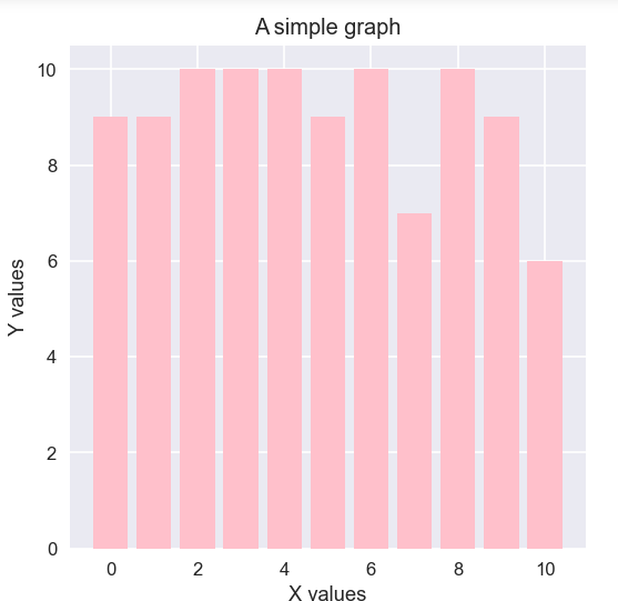
Code:
import random
from matplotlib import pyplot as plt

plt.figure(figsize = (5, 5))
x = []
y = []
plt.xlabel("X values")
plt.ylabel("Y values")
plt.title("A simple graph")
N = 50
for i in range(N):
    x.append(random.randint(0, 10))
    y.append(random.randint(0, 10))

plt.bar(x, y, color = "pink")
plt.show()
Output:
Explanation:
- In this code the first two lines of code import the pyplot and random libraries.
- In the second line of code, we use the figure() function. In that, the figsize parameter takes a tuple of the height and width of the plot layout.
- This helps us decide how much height we are giving.
- The random function inserts random values from ranges 1 to 10 in each of the two lists x, y.
- Then call the bar() function to create bar plots.
Resizing Plots in Matplotlib
This library is for creating subplots on a single axis or multiple axes. We can implement various bar plots on it. It helps to create common layouts for statistical data presentation.
Using figsize
Code example:
from matplotlib import pyplot as plt
import numpy as np

N = 5
menMeans = (20, 35, 30, 35, -27)
womenMeans = (25, 32, 34, 20, -25)
menStd = (2, 3, 4, 1, 2)
womenStd = (3, 5, 2, 3, 3)
ind = np.arange(N)    # the x locations for the groups
width = 0.35       # the width of the bars: can also be len(x) sequence

fig, ax = plt.subplots(figsize = (6, 6))

p1 = ax.bar(ind, menMeans, width, yerr=menStd, label='Men')
p2 = ax.bar(ind, womenMeans, width,
            bottom=menMeans, yerr=womenStd, label='Women')

ax.axhline(0, color='grey', linewidth=0.8)
ax.set_ylabel('Scores')
ax.set_title('Scores by group and gender')
ax.legend()

# Label with label_type 'center' instead of the default 'edge'
ax.bar_label(p1, label_type='center')
ax.bar_label(p2, label_type='center')
ax.bar_label(p2)

plt.show()
Output:

Explanation:
- The first two lines are import statements for modules.
- Then we define two tuples for men and women distribution values.
- To divide the graph the standard divisions are menStd and womenStd.
- Then the width of each bar is set to 0.35.
- We create two objects fig and ax of plt.subplot() function.
- This function has one parameter figsize. It takes a tuple of two elements depicting the resolution of the display image (width, height).
- Then we assign two variables p1 and p2 and call the bar() method using the ax instance.
- Then lastly just assign the labels to x-y axes and finally plot them.
Categorical plotting using subplots
The categorical data – information with labels plotting is also possible with matplotlib’s subplot. We can use the figsize parameter here to divide the plots into many sections.
Example:
from matplotlib import pyplot as plt

data = {'tiger': 10, 'giraffe': 15, 'lion': 5, 'deers': 20}
names = list(data.keys())
values = list(data.values())

fig, axs = plt.subplots(1, 3, figsize=(9, 3), sharey=True)
axs[0].bar(names, values)
axs[1].scatter(names, values)
axs[2].plot(names, values)
fig.suptitle('Categorical Plotting of presence of all the animals in a zoo')
Output:

Explanation:
- At first, we create a dictionary of all the key-value pairs.
- Then we create a list of all the keys and a separate list of all the values.
- After that create a simple instance of the subplots() class.
- To write the necessary parameters, we give 1 at first to declare the number of rows. 3 to declare the number of columns. Thus, there are three plots on a single column
- Here, figsize is equal to (9, 3).
- Then we place each plot on the axes. Using the list functionality,
- ax[0] = bar graph
- ax[1] = scatter plot
- ax[2] = a simple line graph
- These show the presence of all the animals in a zoo.
Conclusion
So, here we learned how we can make things easier using subplots. Using the figsize parameter saves space and time for data visualization. So, I hope this is helpful. More to come on this topic. Till then keep coding.