🚀 Supercharge your YouTube channel's growth with AI.
Try YTGrowAI FreeHow to Plot K-Means Clusters with Python?
In this article we’ll see how we can plot K-means Clusters.
K-means Clustering is an iterative clustering method that segments data into k clusters in which each observation belongs to the cluster with the nearest mean (cluster centroid).
Steps for Plotting K-Means Clusters
This article demonstrates how to visualize the clusters. We’ll use the digits dataset for our cause.
1. Preparing Data for Plotting
First Let’s get our data ready.
#Importing required modules

from sklearn.datasets import load_digits
from sklearn.decomposition import PCA
from sklearn.cluster import KMeans
import numpy as np

#Load Data
data = load_digits().data
pca = PCA(2)

#Transform the data
df = pca.fit_transform(data)

df.shape
Output:
(1797, 2)
Digits dataset contains images of size 8×8 pixels, which is flattened to create a feature vector of length 64. We used PCA to reduce the number of dimensions so that we can visualize the results using a 2D Scatter plot.
2. Apply K-Means to the Data
Now, let’s apply K-mean to our data to create clusters.
Here in the digits dataset we already know that the labels range from 0 to 9, so we have 10 classes (or clusters).
But in real-life challenges when performing K-means the most challenging task is to determine the number of clusters.
There are various methods to determine the optimum number of clusters, i.e. Elbow method, Average Silhouette method. But determining the number of clusters will be the subject of another talk.
#Import required module
from sklearn.cluster import KMeans

#Initialize the class object
kmeans = KMeans(n_clusters= 10)

#predict the labels of clusters.
label = kmeans.fit_predict(df)

print(label)
Output:
out: [0 3 7 ... 7 4 9]
kmeans.fit_predict method returns the array of cluster labels each data point belongs to.
3. Plotting Label 0 K-Means Clusters
Now, it’s time to understand and see how can we plot individual clusters.
The array of labels preserves the index or sequence of the data points, so we can utilize this characteristic to filter data points using Boolean indexing with numpy.
Let’s visualize cluster with label 0 using the matplotlib library.
import matplotlib.pyplot as plt

#filter rows of original data
filtered_label0 = df[label == 0]

#plotting the results
plt.scatter(filtered_label0[:,0] , filtered_label0[:,1])
plt.show()

The code above first filters and keeps the data points that belong to cluster label 0 and then creates a scatter plot.
See how we passed a Boolean series to filter [label == 0]. Indexed the filtered data and passed to plt.scatter as (x,y) to plot. x = filtered_label0[:, 0] , y = filtered_label0[:, 1].
4. Plotting Additional K-Means Clusters
Now, that we have some idea, let’s plot clusters with label 2 and 8.
#filter rows of original data
filtered_label2 = df[label == 2]

filtered_label8 = df[label == 8]

#Plotting the results
plt.scatter(filtered_label2[:,0] , filtered_label2[:,1] , color = 'red')
plt.scatter(filtered_label8[:,0] , filtered_label8[:,1] , color = 'black')
plt.show()

Wonderful !
5. Plot All K-Means Clusters
Now, that we got the working mechanism let’s apply it to all the clusters.
#Getting unique labels

u_labels = np.unique(label)

#plotting the results:

for i in u_labels:
    plt.scatter(df[label == i , 0] , df[label == i , 1] , label = i)
plt.legend()
plt.show()
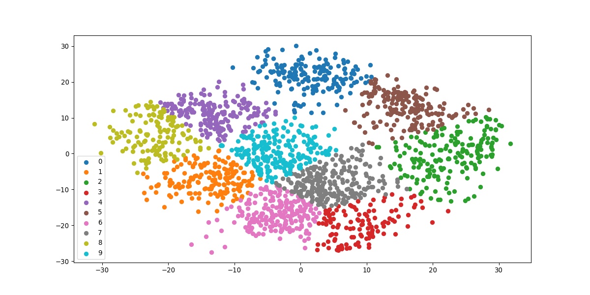
The above code iterates filtering the data according to each unique class one iteration at a time. The result we get is the final visualization of all the clusters.
6. Plotting the Cluster Centroids
#Getting the Centroids
centroids = kmeans.cluster_centers_
u_labels = np.unique(label)

#plotting the results:

for i in u_labels:
    plt.scatter(df[label == i , 0] , df[label == i , 1] , label = i)
plt.scatter(centroids[:,0] , centroids[:,1] , s = 80, color = 'k)
plt.legend()
plt.show()

kmeans.cluster_centers_ return an array of centroids locations.
Here’s the complete code of what we just saw above.
#Importing required modules

from sklearn.datasets import load_digits
from sklearn.decomposition import PCA
from sklearn.cluster import KMeans
import numpy as np

#Load Data
data = load_digits().data
pca = PCA(2)

#Transform the data
df = pca.fit_transform(data)

#Import KMeans module
from sklearn.cluster import KMeans

#Initialize the class object
kmeans = KMeans(n_clusters= 10)

#predict the labels of clusters.
label = kmeans.fit_predict(df)

#Getting unique labels
u_labels = np.unique(label)

#plotting the results:
for i in u_labels:
    plt.scatter(df[label == i , 0] , df[label == i , 1] , label = i)
plt.legend()
plt.show()
Conclusion
In this article, we saw how we can visualize the clusters formed by the k-means algorithm. Till we meet next time, Happy Learning!


